When people start creating designs for printing, one of the first things that confuses them is color mode. Designers talk about RGB. Printers talk about CMYK. New authors, small business owners, and students often wonder why their printed colors look different from what they see on the screen. This guide will clear that confusion and give you a complete understanding of both color modes. If you want perfect results in Book Printing, brochures, posters, business cards, or any printed material, this guide will help you make the right choices.
Color might look simple, but it works very differently on screens and on paper. That is why knowing the difference between RGB and CMYK is not optional — it is essential.
Let’s explore everything you should know before sending your design for print.
Why Understanding Color Mode Matters in Printing
You can design the most beautiful artwork, but if you choose the wrong color mode, your print may look dull, washed out, or even completely different. Many beginners design in RGB because it looks vibrant on screen. However, printers use CMYK. When the file converts from one mode to another, the colors shift.
Understanding color mode ensures:
- Your printed design matches your screen as closely as possible
- You avoid costly reprints
- Your brand colors stay consistent
- You save time on revisions
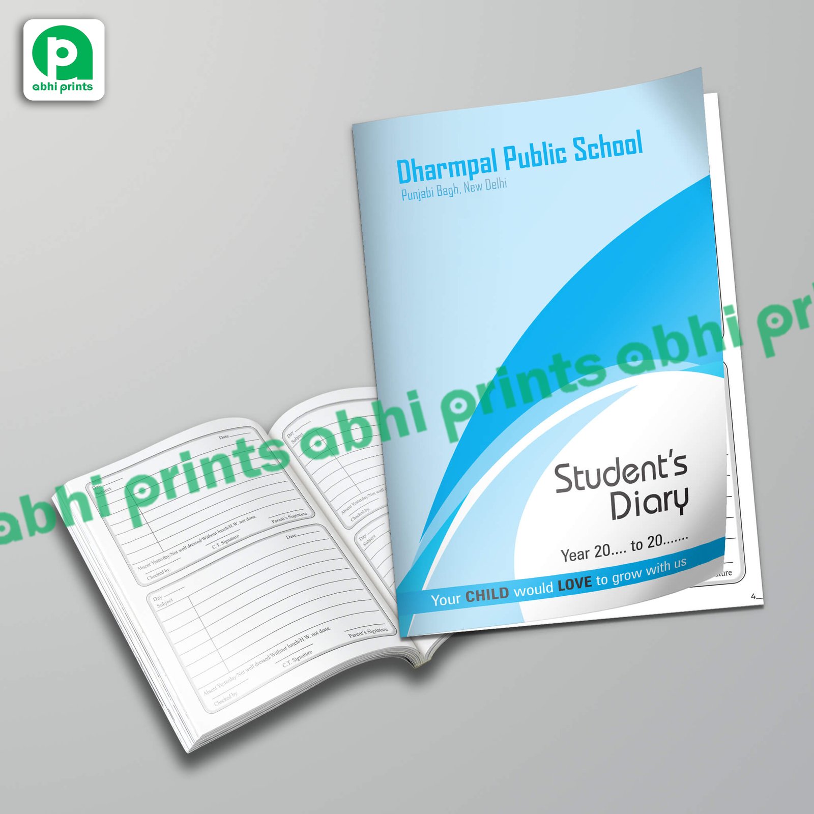
- Your Book Printing project maintains professional quality
Most print-related issues start with an incorrect color mode. Knowing the difference avoids disappointment later.
What Is RGB?
RGB stands for Red, Green, and Blue. These are the colors that screens use to create images. Your phone, laptop, TV, and tablet all display colors using RGB light.
RGB adds colors together. When you mix all three at full intensity, you get white. When you reduce everything to zero, you get black. This is called an additive color model.
Where RGB is used
RGB is perfect for anything you view on a screen, such as:
- Websites
- Social media posts
- Mobile and laptop screens
- Digital art
- Online ads
- E-books
RGB colors are often very vibrant and bright because screens emit light. This is why something that looks neon on your screen doesn’t always print the same way on paper.
Advantages of RGB
- More color range (wide gamut)
- Stronger brightness
- Perfect for digital use
- Ideal for animations and screen-ready graphics
Limitations of RGB
- Not suitable for print
- Colors appear different when converted to CMYK
- Neon or glowing effects usually don’t print accurately
RGB is amazing for digital design, but not for printing physical materials.
What Is CMYK?
CMYK stands for Cyan, Magenta, Yellow, and Black (Key). These are the ink colors used in printers. CMYK works by subtracting light, which is why it is called a subtractive color model.
When you mix cyan, magenta, and yellow, you get darker colors. When you mix all three heavily, they form a muddy dark color. Black ink (K) helps create a deeper, richer black.
Where CMYK is used
CMYK is used to print anything on physical material:
- Books
- Brochures
- Flyers
- Business cards
- Magazines
- Posters
- Packaging
- Diaries
- Catalogues
If you are preparing artwork for Book Printing, CMYK is the correct color mode.
Advantages of CMYK
- Ideal for printing
- Colors stay consistent on paper
- Accurate ink representation
- Professional quality results
Limitations of CMYK
- Smaller color range than RGB
- Some bright RGB shades cannot be printed
- Requires careful color management
If you want reliable printing results, always work in CMYK from the beginning.

Why RGB Looks Different from CMYK
The simplest reason is:
RGB uses light, CMYK uses ink.
Screens create brightness by shining light, while paper reflects light that falls on it. Because of this basic difference, RGB can show more vibrant, neon-like colors that CMYK cannot reproduce.
Common color differences
- Neon greens
- Bright oranges
- Hot pinks
- Vivid purples
- Very bright blues
Printers convert these vibrant RGB shades into CMYK-friendly tones, making them appear duller.
This is why you must design in the correct mode based on the final output.
Why Printers Prefer CMYK Files
Professional printing needs exact color control. When printers receive RGB files, their software automatically converts them into CMYK. This conversion is not perfect and may cause:
- Unpredictable color shifts
- Loss of brightness
- Mismatched brand colors
- Poor skin tones
- Dull gradients
To avoid this, most print shops (including those offering Book Printing) request CMYK files right from the start.
How Color Mode Impacts Book Printing
When authors design book covers, illustrations, or inside pages, they often make one mistake — they create the artwork in RGB. But printing machines run on CMYK.
If you design a vibrant cover in RGB, the printed version may disappoint you. Areas such as:
- Sky
- Skin
- Hair
- Decorative elements
- Logos
- Typography
may look different.
To maintain quality in Book Printing, always start your project in CMYK. It keeps your colors stable and predictable.
How to Choose the Right Color Mode
Choosing the correct color mode depends on your final result.
Use RGB when your final output will be digital
- Websites
- Online ads
- Social media creatives
- YouTube thumbnails
- Digital books
Use CMYK when your final output will be printed
- Book covers
- Magazines
- Business cards
- Stickers
- Packaging designs
- Posters
- Diaries
- Flyers
If something will get printed, always switch to CMYK before you begin the design.
How to Convert RGB to CMYK Correctly
Most design tools allow simple RGB-to-CMYK conversion. Here is how:
Adobe Photoshop
Go to:
Image → Mode → CMYK Color
Adobe Illustrator
Go to:
File → Document Color Mode → CMYK
CorelDRAW
Go to:
Tools → Color Management → Default Settings → CMYK
Canva
You can export print files by selecting:
Download → PDF Print (CMYK)
Tips for better conversion
- Convert early in the design stage
- Recheck gradients
- Adjust brightness and contrast manually
- Avoid neon shades
- Use CMYK-friendly palettes
This ensures a more accurate print result.
Understanding Color Profiles (ICC Profiles)
Color profiles tell printers and software exactly how colors should appear. They create uniformity between screens and machines.
Common color profiles include:
- sRGB – For digital displays
- Adobe RGB – For photography
- U.S. Web Coated SWOP v2 – Standard for CMYK printing
- FOGRA39 / FOGRA51 – Used widely in modern book and offset printing
If you want the best result in Book Printing, use the color profile recommended by your printer.
Why Your Print Looks Darker Than Your Screen
Many beginners panic when their prints come out darker. This is common. Here’s why:
- Screens are backlit
- Paper absorbs ink instead of emitting light
- Screen brightness is usually too high
- Different paper textures affect color absorption
To fix this:
- Reduce screen brightness while designing
- Use high-quality reference images
- Work in CMYK mode from the start
- Ask your printer for a sample print
This gives you predictable results.
How Paper Type Affects Printed Colors
Even with the same CMYK colors, different paper types produce different results.
Glossy Paper
- Colors look vibrant
- Good for brochures and catalogues
Matte Paper
- Softer and elegant
- Perfect for diaries, book covers, and posters
Textured Paper
- Absorbs more ink
- Colors appear slightly dull
Uncoated Paper
- Best for novels and notebooks
- Gives a natural look
For the best Book Printing, choose paper based on your book’s purpose — not just the color output.
Spot Colors vs CMYK
Spot colors are premixed inks used for exact color reproduction. They usually come from Pantone or similar color systems.
Use spot colors when:
- You need precise brand colors
- You are printing logos
- You want metallic or fluorescent shades
Most books use CMYK, but spot colors work well for premium covers or special editions.
Tips to Get Perfect Print Colors Every Time
Here are simple habits that will improve your printing results:
✔ Design in CMYK for print
✔ Use high-resolution images (300 DPI)
✔ Convert colors early
✔ Avoid extremely bright RGB shades
✔ Check color consistency across pages
✔ Use printer-recommended ICC profiles
✔ Choose paper wisely
✔ Print a sample before bulk order
These steps will help you avoid reprints and maintain professional quality.
Color Mode Mistakes to Avoid
Many beginners make similar mistakes. Avoid these:
- Designing in RGB for print
- Using too many neon colors
- Trusting screen brightness
- Ignoring paper type
- Exporting in wrong format
- Using low-quality images
- Forgetting to embed color profiles
- Not consulting your printer before finalizing artwork
Correct color mode saves you time, money, and stress — especially in large Book Printing orders.
The Future of Color in Printing
As technology evolves, printing machines become more advanced. Some modern printers support extended gamuts like CMYKOGV (Cyan, Magenta, Yellow, Black, Orange, Green, Violet). These machines can reproduce brighter colors than traditional CMYK.
However, RGB-like print results are still impossible because printed ink cannot match the brightness level of a digital screen.
Color management will continue to improve, giving designers more power to create accurate print-ready designs.
Final Thoughts: RGB vs CMYK — Which Should You Use?
Understanding color modes is simple once you know the basics:
- RGB = Digital
- CMYK = Print
If your final output exists on a screen, use RGB.
If your final output goes on paper, use CMYK.
Using the right color mode keeps your artwork accurate, protects your brand identity, and ensures your prints look polished and professional. Whether you are working on Book Printing, marketing materials, packaging, or branding designs, this guide gives you everything you need to make smart color decisions.
A color-accurate print is not the result of luck — it is the result of understanding how colors work.